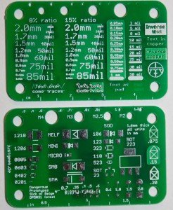
The last step in my PCB design process normally is the silkscreen. When I try to design a nice helpful silkscreen, I often find my self wondering “How small can I make the text?” or “If I put this text over a via, will it still be readable?”. Usually I end up digging around some old designs to find some examples of what worked, and what didn’t. But during my last run, I got a bit annoyed and decided to include a small reference board for the most common situations.
The board itself is designed to the Dangerous Prototypes Sick of Beige standard with a size of 50mm x 31mmm and I used Seeed Studios fusion service to produce them.
Update: Since a few people wanted to buy one of these cards, I started a Tinde Fundraiser for them.
The front of the board is dedicated solely to various silkscreen situations. Right in the middle are text examples in various sizes, ranging from 2.0 mm (rather large) to 0.5 mm (unreadable). Since the relationship between ratio and size can be a bit hard to visualize, I included the samples both in 8% (skinny) and 15% (quite fat). And for the rare occasion that I design a THT board, I also added a few examples in mil instead of milimeters.
To the left of the text area are a few silkscreen lines of varying thickness. While those are relatively straightforward, I wanted to see how well the thinner lines would come out.
The border of the board is filled with examples of various situations that might occur with silkscreen text. On the bottom left, is the most common situation, a small text over some traces. This is mostly to put my mind at ease, usally this should be very legible. To the right, there is a text riddled with vias in varying shapes and sizes. After that is a small example of a text written in copper, with the stop mask removed to make it shiny. And the last example on the bottom gives us a view of the raw substrate, without stopmask, silkscreen or copper.
On the top right is a similliar construction, only this time it is surrounded by silkscreen, to create a negative effect. Below are two examples of writing the text in the copper layer – one normal and one reversed.
For more detail: Simple silkscreen reference board

